Mint Fall Outfits with Rust, Peacock Blue, Burgundy, and Neutrals

Today I'm talking outfit color combinations for autumn again, now switching from pink to mint...another color that stands outside the traditional fall color palette but that can mix beautifully with popular fall colors.
Here are three mint items from my wardrobe that work well in creating fall outfits: a mint cardigan with a floral print in a range of autumn colors, a mint cardigan vest with a mix of textures, and a mint button up shirt with small black embroidered hummingbirds.

Let's look at some of my outfits of the day featuring these items for some colorful fall outfit inspiration.
Mint + Rust
In my post on rust color combos with teal, I considered that mint shirt for a possible pairing with my rust pants, noting that the colors share a desaturated quality but that I wasn't sure how the much lighter value of the mint would work with the darker rust. I challenged myself to experiment further with this color combo, which I did a few days ago!
For OOTD #1, I topped the mint shirt and rust pants with the mint cardigan vest. It's funny...I hadn't really thought about wearing these two mint pieces together before, but I really like the combination (which is yet another variant on the "modern twin set" concept of matching top + topper).

I doubled down on the fall theme with this teal and brown paisley scarf that doesn't match either the mint or rust but that coordinates well with them as it has lighter teal areas and warm rusty brown areas. I added brown leather flats to pick up the brown from the scarf. Because I'm a bit obsessive this way, I added two bead necklaces to make the brown + black (from the hummingbirds) combination feel more intentional: a beige "leopard" stone bead with black spacers (top) and a brown-with-teal-flecks bead with brown spacers (bottom). I have had both of these necklaces, which were made for me by a friend, for over 25 years.

For my daily bracelet stack, I wore a DIY bracelet set that I put together to coordinate with the mint floral cardigan above. I made the two teal glass bead bracelets and the two paper bead bracelets (both made from clothing catalog pages). The rust agate bead bracelet with the rabbit charm was a gift from my husband that works perfectly with this set.

Mint + Peacock Blue
Earlier this month, I wore the mint floral cardigan with a pseudo inner column of color consisting of a peacock blue tank and dark wash denim ankle pants in OOTD #2. The peacock blue tank matches the blue in the floral print exactly - I bought them both from the CJ Banks winter 2020 offerings in their "peacock blue" colorway. However, I don't think that the blue in the print is at all required to make a success of a mint + peacock blue/teal pairing! I can readily see solid pieces in these colors going together very well in an outfit. Depending on the specific versions of the colors, mint and peacock blue are either both based on the Blue-Green hue of the color wheel or are in the range of Green, Blue-Green, and Blue. So this is just a variant of a monochromatic or analogous color combination.

I accessorized with brown leather flats (again) and a layered necklace in mixed metals, rose gold, and gold. You can see here that I tucked the edges of the cardigan under to form an opening in a shape that mimics the triangle of the long necklace chain. This cardigan has a traditional rounded crew neckline that was interfering with the necklaces so I adjusted it this way (and for what it's worth, the edges stayed tucked under all day without any additional futzing). This is not an adventurous Jodie-like cardigan trick, but sometimes even a very basic tweak like this one can make a difference in how your pieces work together and in how satisfied you are with the fit, silhouette, proportion or style of your outfit.

This bracelet stack is based on the second DIY bracelet set I made to coordinate with this cardigan. In this one, the tube beads are rust leaf print on a teal background (instead of teal floral on a light rust background) and the bicone beads are pale mint/rust/brown stripes (instead of darker mint/rust/beige stripes). I added the rust/silver rabbit bracelet again, but instead of the teal glass bead bracelets, I used a dull orange stone bead bracelet and a mixed metal spacer bracelet.
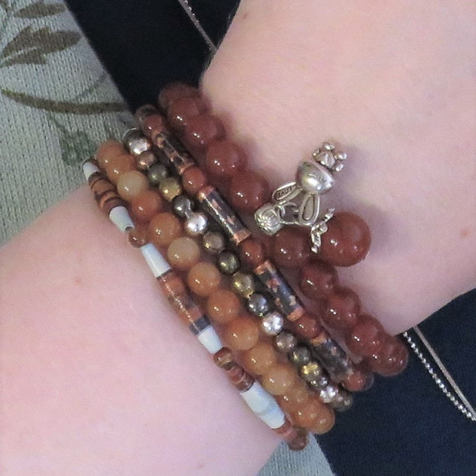
Yeah, I made two sets based on the same cardigan with the same basic color scheme! The first one I made in a mint/rust/silver colorway using silver spacers, while the second one is in a mint/rust colorway using rust agate spacers (i.e., doesn't use a specific metal). Sometimes I like to have one set in silver and one in gold, or one in a specific metal and other other without a metal, to make coordinating with other jewelry easier.
Mint + Burgundy
This one surprised me a bit. For OOTD #3, I decided to try the mint cardigan with all the fall colors in the print with a different fall color not in the print...and I think it worked very well! The cardigan has rust and a hint of mauve, and the burgundy just felt like it fell in the span of those colors. For my layered necklace, I chose three pieces based on rose gold/bronze metals (the owl, the sloth, and the bird charms that are in the middle but hard to see) and two beaded necklaces (the same "leopard" one as in the rust OOTD #1 and a seed pearl necklace with brown and rust spacers) made by my friend. I finished the outfit with dark wash jeans and my cheetah Oxfords.

This bracelet stack is a fun colorful one based on a set I made to coordinate with a burgundy print blouse that has a bunch of colors in it. I made the three paper bead bracelets and the multi-color stone bead bracelet and added a gold spacer bead bracelet from my Amazon set. This set is surprisingly versatile because it has a lot of muted semi-neutral colors like burgundy, olive, dark purple, and blush pink that are easy to coordinate with other colors.

Mint + Dark Green
This was not an obvious combination to me, but once I tried it, I thought it worked out really well...which makes sense because it's another analogous color combo in which both colors are desaturated. The mint is like a Green or Blue-Green with a lot of white in it (a "tint"), and the dark green is a Green with a lot of black in it (a "shade").
Here are two examples of how I've worn the mint hummingbird button up shirt with my dark green cardigan and black pants. OOTD #4 includes black skinny pants, grey/black leopard print wedges, and a short layered necklace (neck mess) with black hematite beads and a couple of silver chains (and my silver White Rabbit charm).

I created a bracelet stack in black, green, and white from various bracelets in my collection (not started with a specific bracelet set this time!): black/white paper tube beads, black and spacer beads, green jade chip beads, black and clear crackle beads, and another with black beads. All DIY except the jade beads that were a gift from husband that just happened to come already strung on elastic that fit me perfectly as a bracelet.

This similar OOTD #5 has black jeggings, black studded flats, and a layered necklace built on gold, pearls, and a few DIY seed bead strands in various shades of green. The black embroidered hummingbirds on the shirt make black the obvious neutral to finish the mint + dark green combo here, but especially if you have a solid mint piece with your dark green, just about any neutral color would work.

Mint + Black/Grey
The next two outfits use my mint cardigan vest with a combination of black and grey neutrals and a colorful scarf. In OOTD #6 a black long-sleeved T and black/grey herringbone pants form a very simple base outfit that could be finished a million different ways. I added the mint vest and accessorized with a chevron print scarf with a coordinating teal in the print. I chose purple flats to draw on the purple in the scarf and add a second accent color.

OOTD #7 started with a grey long-sleeved T, grey/black striped skirt, black tights, and the leopard wedges from OOTD #4...another great base outfit to which almost any accent color could be added. This mint version features the mint vest and a scarf in a brighter version of mint with a floral print including both black and grey. This scarf is somewhat spring-like to my eye because it is florals on a light background color, but there's no law against wearing a more spring-like motif any time you want! But for a more traditional autumn option, you could easily substitute a scarf with a darker color scheme or more fall-like print (e.g., plaid, paisley, leaves/trees, leopard) or texture (e.g., knitted, quilted, pashmina, wool/silk jacquard).

Mint + Navy
Finally, OOTD #8 started with the navy floral skirt, to which a navy T + tights/boots and the mint cardigan were added based on the colors of the skirt (aka Road Map styling). The white scarf with rose gold polka dots (coordinating with the white and peach in the skirt) adds some lightness to the look (which is good with my coloring), but a darker color would also be great here. I think a solid dark orange or rust scarf would be a marvelous fall option, for example, since those colors are like a darker version of the peach...and we established in OOTD #1 that mint and rust work very well together. Another option that has a stronger autumn vibe would be to substitute cognac boots for the navy ones. But I wore this outfit in November and felt just right for the season/weather.

Do you have any mint (or other Blue-Green based colors) in your wardrobe? Do you wear it in fall? Do you have a favorite fall scarf color, print, or texture?
Blogs I link up with are listed here.


Thể thao QQ88 khiến mình muốn tìm hiểu kỹ hơn cách một nội dung có nhiều lựa chọn được tổ chức và trình bày. Mình thường bắt đầu bằng việc quan sát thứ tự các mục và cách những thông tin quan trọng được phân biệt. Với bóng đá, mình chú ý đến cách tên giải đấu, trận đấu và các lựa chọn kèo được sắp xếp để người xem xác định đúng nội dung cần tìm. Sau đó, mình chuyển sang bóng rổ để đối chiếu cách trình bày giữa hai môn. Điều mình quan tâm là khả năng ghi nhớ vị trí và quay lại phần đã xem sau vài lần chuyển đổi. Một cấu trúc có phân cấp…
ee88 link giúp mình để ý rõ hơn đến cách mình giữ phương hướng khi một phiên không chỉ tập trung vào một khu. Thể thao có thể là phần mình dành thời gian đầu tiên, rồi trong quá trình sử dụng mình mới chuyển sang Game bài. Mình thường nhìn các mốc trên menu để nhận biết phạm vi hiện tại thay vì ghi nhớ từng vị trí nhỏ. Khi nội dung trung tâm thay đổi, những điểm quen này vẫn giúp mình xác định được hướng đang đi. Với mình, cách tổ chức đó làm việc chuyển khu nhẹ hơn, nhất là những lúc mình muốn tiếp tục khám phá mà không cần quay lại trang đầu để lựa…
https://ml88.store/ khiến mình chú ý đến cách Thể thao được đặt cạnh những khu vực có cách sử dụng khác nhau. Mình thường bắt đầu bằng một giải đấu, xem bảng tỷ lệ kèo rồi chuyển sang Casino để tìm Blackjack hoặc Baccarat. Sự thay đổi về nội dung khá rõ nhưng mình vẫn dễ xác định khu vực đang xem. Khi muốn đổi sang Nổ hũ, các chủ đề và hiệu ứng hình ảnh tạo cảm giác khác hơn so với bàn chơi trực tiếp. Bắn cá cũng là một hướng riêng khi mình muốn thay đổi nhịp. Với mình, các nhóm nội dung được tách đủ rõ để việc chuyển qua lại không gây rối.
fly88 khiến mình để ý đến phạm vi nội dung khi quan sát Thể thao, Đá gà, Casino và Xổ số từ phần tổng thể. Mỗi nhóm có hướng riêng nên mình chủ yếu nhìn tên danh mục và vị trí hiển thị trước khi quyết định phần nào cần đi sâu. Hình ảnh trên giao diện trở thành dấu hiệu bổ sung giúp từng vùng dễ nhận biết hơn bằng mắt. Dù lần này mình xem nhiều nhóm hơn, mình vẫn không cần mở lần lượt tất cả lựa chọn bên trong. Cách phân cấp từ danh mục lớn xuống nội dung cụ thể giúp mình nắm được bức tranh chung khá nhanh
f168.com cho mình ấn tượng khá rõ khi mình so sánh cách các khu vực xuất hiện trên máy tính và điện thoại. Mình quan sát Casino cùng Game bài trên màn hình lớn rồi chuyển sang Thể thao trên mobile để xem bố cục được điều chỉnh ra sao. Máy tính cho mình nhìn tổng thể rộng hơn, còn điện thoại khiến các phần được trình bày theo từng lớp gọn hơn. Dù không gian hiển thị thay đổi, tên danh mục vẫn là những dấu hiệu mình dễ nhận ra khi chuyển thiết bị. Sau vài lần sử dụng xen kẽ, mình có thể dựa vào cấu trúc đã quen để tìm khu vực cần xem mà không phải…