2 Coral and Grey Leopard Outfits + DIY Paper Bracelet Page to Bead Examples
- sallyinstpaul

- Jul 7, 2023
- 5 min read
It's been a minute since I posted, and I'm glad to be back today with two OOTD from this spring/summer featuring sandstone coral clothing and the grey leopard wedges I featured in my last post.
These two outfits are a bit of a "break the rules" situation. A common piece of advice is to create outfits that include all warm tones or all cool tones, so the go-to combinations would look like...
Warm: sandstone coral clothing + warm-tone shoes
Cool: cool-tone clothing + grey leopard shoes
This tone matching is something I (and probably many of you) do reflexively when putting colors together. And I think it's a "rule" with diagnostic value: if there is something off about an outfit, it definitely is worth considering whether the tones you've put together don't work well together. Sometimes just switching out the shoes for a tone that matches the outfit can make the outfit look better.
But it's not a RULE rule...more of a guideline...so it's also worth playing around with mixing up your tones to see if you like it. And for some reason, I really like pairing sandstone coral with grey!
I built this first outfit around the scarf, pulling black plus two accent colors from the print using the Road Map Styling technique. I had not tried pairing the sandstone coral jacket and teal skirt together before, but I liked how it turned out in this outfit...and I think it would also look great as a colorblocked outfit without the scarf as a bridge piece tying the colors together. Red-Orange and Blue-Green form a complimentary color scheme (opposites on the color wheel) so it makes sense that they would play well together. I really liked the low contrast between the black top and the dominantly black scarf also; the top just blends in seamlessly with the scarf, letting the colors and the print be the star of the show. Imagine how different this would look with the default white T instead of the black one. (I tied the scarf using one of my top summer scarf tying techniques - Method #5: loop to front with ends brought through as shown here.)

You can see that the colors of the knit jacket and skirt are not identical to the versions in the scarf. The scarf colors are more bright orange than coral and more aqua than teal, but we don't have to get overly precise when using a print as the inspiration for our color selection. Feel free to experiment with looser interpretations of a color rather than thinking you need an exact match. The resulting outfit can feel more fresh and modern than when using only perfectly matchy-matchy colors, and it increases your outfit options drastically when you are less stringent about which colors go with other ones.

I certainly could have worn my tan leopard flats in this outfit instead of the grey wedges to achieve the same level of low key print mixing while matching the warmth of the coral color. But I think the grey leopard looks great with this outfit, and I liked that the black captoe on the wedges repeats the color of the top for a slight bookending effect.

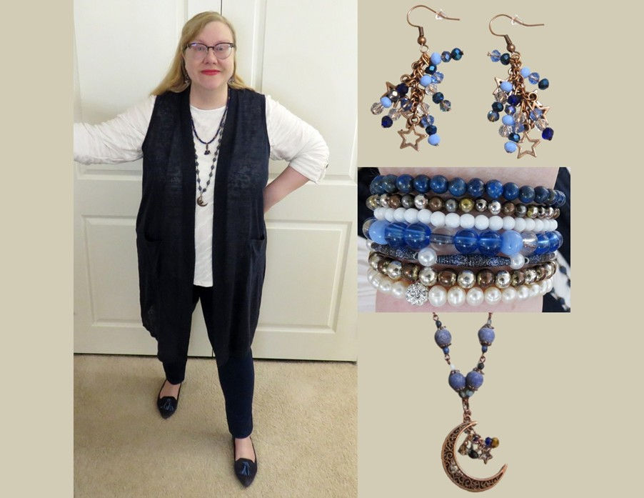
My daily bracelet stack started with 3 DIY paper bead bracelets from my orange/black/purple/gold set, supplemented by a rose gold bracelet from Amazon, a DIY black/clear bead bracelet, and a new stand-alone bead bracelet in shades of brown and rose gold (the bottom one in this photo).

I loved seeing a very expensive men's watch with rose gold in a nice big full-page ad in The Economist. Rose gold is too often thought of as a "women's" color, which is ridiculous. The combination of rose gold and various brown shades in this ad was just delicious to look at (maybe because the browns resemble chocolate??), and I thought the page would make good paper beads. I doctored my strips in two ways. (1) I colored over the white text on my strips with a medium brown marker. (2) I covered the white paper core on the edges with black so that the beads would roll up with narrow black stripes against the brown background. Didn't these beads turn out luxuriously and richly colored? (Seems appropriate for an image of a watch that sells for $200,000+!)


My second outfit started with the white blouse and sandstone coral cardigan (matching an accent color in the blouse). The burgundy skirt was the wild card in this look that I added using Jodie's "color not in the print" option from her color recipe. I chose it using a simple shop your closet technique: asking myself what skirt I hadn't worn in a while that could possibly work with this outfit. (In my case, I consulted my spreadsheet to identify my contenders, but whatever way you have of picking out a not-recently-worn or under-utilized item will work.) When I put the burgundy up to the sandstone coral, I loved the combination! Both are warm red-based colors (Red-Violet and Red-Orange on the color wheel) so they harmonize well, but they create an unexpected combination.

I added this ombré scarf in a rich dark coral blending into magenta to reinforce the Red-Orange + Red-Violet color story. Again, these colors don't match the others in the outfit but are similar. The necklace introduces another couple of variants on the coral color concept too.

I wore my go-to sparkly gold headband and a pair of simple flat gold studs with small pink dots on them. I purposely chose colors that blend into my hair to keep this part of the look low-key.

I chose my grey leopard wedges for this outfit because I am making an effort to wear them more often this summer...both to keep working down the cost per wear and because I'm trying to break my tradition of usually wearing them in cold weather.

My daily bracelet stack is based on a new paper bead bracelet set inspired by my new sherbet check linen top. For this set I drew on the purple, pink, and orange colors in the print top and chose gold as the metallic color to finish it. (The DIY dark burgundy garnet bead bracelet is not part of this set, but I added it to reflect the color of my skirt.)

Sunrise/sunset photo images make great paper beads, and this image of sunrise at Bosque del Apache National Wildlife Refuge (New Mexico) in Birdwatching magazine is no exception. Nature does such a wonderful job of mixing colors...I mean, just look at the variety of cool and warm tones working beautifully together in the first strip below. On the middle three strips, I added some black marker to the tip to color over a light area, then rolled them all up into pretty bicone beads. I love how each bead is unique yet they come together well in the bracelet.

My second page is a colorful drawing accompanying an article in The Economist. (Goes to show that any magazine can yield amazing paper for making beads! I bet this drawing is not what comes to mind when thinking of a serious-sounding magazine like The Economist, but they actually have a lot of good pages.) It has a terrific combination of colors and prints. I didn't do a single thing to this paper; I just cut the strips and rolled them up into a fun set of striped paper beads.


Do you like to mix warm and cool colors? Would you wear coral + teal? Or coral + burgundy? Do you ever pick items based on how long it's been or how infrequently you wear them? Do you treat leopard print like a neutral?
Blogs I link up with are listed here.


Love your roundup of winter styles, Tania! For anyone looking for versatile leather jackets this season, check out Jacket store USA
I have a little coral bag and I tried it with a teal floral dress once - I really liked the combination! I find teal is not one of the colours I'm that adventurous with but I am loving both of these outfits on you, especially that first one as the teal skirt is perfect with the coral cardigan, and the scarf ties it all together perfectly :)
Thanks for joining the Weekday Wear Link up :)
I love coral and I really love how you create paper bead bracelets to pair with your outfits. You really should share your collection and how you organize it.
www.chezmireillefashiontravelmom.com
Hmmm...I wonder if that's why outfits I think will work frequently don't. They're on different spectrums. I never thought about it. Most of my closet is pretty well curated at this point so I usually buy the colors I know work best for me. But, that doesn't mean I don't get suckered into something just because I love the way it looks! Love those beads...you are a genius, Sally!
https://marshainthemiddle.com/
Oh, you've done it again. These are just gorgeous beads. I especially like all of the colors in the last set of beads. Do you put together an outfit and then look for a page from which to make beads to match? I believe that's what you do but you might made the beads first. I followed your link to the post about the Land's End sherbet top and those beads are lovely, too. I like the pattern mixing of the floral tennies with your two print tops. Just A+!!