Combining Magenta and Orange in a Summer Outfit for SIA: Vogue Cover

Salazar at 14 Shades of Grey is the curator for this round of Style Imitating Art (SIA), and she selected the July 1, 1919 cover for Vogue magazine by illustrator Helen Dryden. As she put it: "We’re at the height of summer, so I thought a summery image like this would be appropriate, and there’s a ton of inspiration here for an outfit as well (naturally, since it’s Vogue!)" Of course, I loved that there were so many colors and prints for us to work with in this drawing!

With so many choices in an artwork, it can be easy to get overwhelmed, so I decided to focus my attention on the parasol-wielding wader that is the focus of the illustration.

-When I saw her billowing scarf with what appears to me to be fruit motifs, I immediately thought of my relatively new tropical fruit silky scarf that I had not yet featured on the blog. The mint background relates nicely to the sky, water, and another woman's parasol.
-I don't have a black dress, and I wasn't feeling that much black anyway.
-The orange parasol has a similar shape, color, and "ridged" quality as my coral pleated skirt.
-Because my scarf isn't pink, I wanted a pink cardigan - I have have a couple choices, but I decided on this hot pink one because it's cool with the open weave and I wanted to try it out as part of my summer closet edit. (Thankfully, it's staying in my wardrobe!)
-That left black for my top, so I chose a simple black tank.
-I wasn't 100% sold on the bright teal flats but wanted to try them because with her feet in the water, she looks like she's wearing teal shoes.
The outfit came together much like I'd expected, and I was happy with it! (I do wish I'd noticed that I had pulled my skirt's waistband out of position before I took the photos; it's sitting a bit awkwardly low here.)

The hot pink (almost a magenta pink) cardigan and coral skirt were a bit of a challenging combination for me, and though the scarf helped tie the colors together, I didn't think it entirely sold the combination. So I added my bright pink/orange/gold Lollipops Life DIY layered necklace (previously shared here with details) to further connect the colors. I also liked how the bright necklace popped against the black top.

Note: when I ordered this scarf on ThredUp, I completely thought that it had a tropical bird pattern from the photo! See how the watermelon and pink lines at the bottom sort of look like a flamingo? The obvious fruit like the grapes didn't show in the image on their site, which was rather small and showed the scarf curled up so the pattern was obscured, so I did not get clued in. I was happy enough with the fruit instead, but I was was not expecting it! That's one thing about shopping online - there can be a bit of a surprise factor. (I have since realized that I can download the image from the site and enlarge it, which can help with details, but it's still a roll of the dice.)
I liked the teal ballet flats, but I also tried a pair of black ballet flats with a multi-color floral print as an alternative that would repeat the black color from the top. I actually thought that looked pretty great, but ultimately I was determined to have "teal water" feet to match our inspiration artwork...and the teal ones had the benefit of repeating the blue-green of the scarf background.

Fortunately I had already made a paper bead bracelet set to coordinate with the fruity scarf that would work well with this outfit. I enjoyed popping on DIY glass beaded bracelets in teal, coral, and pink (the main colors of the outfit) to fill out the stack. {stretch bracelet tutorial} {bicone paper bead tutorial} {tube paper bead tutorial}

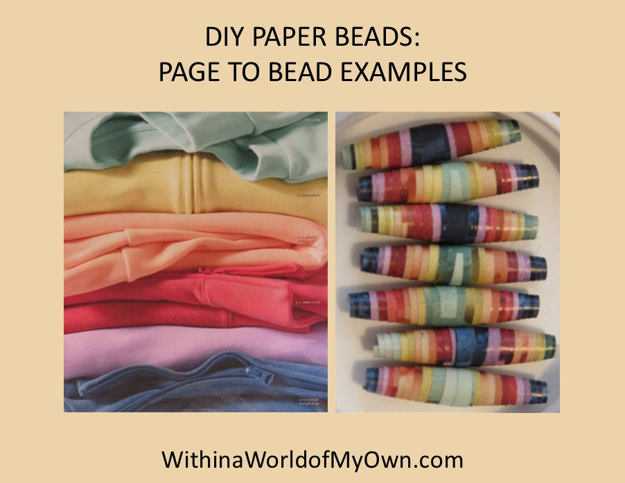
The top "striped" paper bead bracelet started out as a full-page image of a colorful sweatshirt stack in a Lands End catalog. It wasn't a perfect match to my scarf's color palette with the dark blue at the end, but I didn't mind it. (If I'd wanted to exclude the blue, it would have been easy to cut off that part of the paper, leaving the lavender color as the end.)

The second paper bead bracelet (third in the stack) came from an Economist magazine's illustration of retro robot heads in a vibrant yellow, pink, and coral-orange color palette. This paper made some really fresh and fruity-looking beads.

The last paper bead bracelet (bottom of stack) has a less-expected origin as a page from an Amazon toy catalog. I liked the combination of the pink at the top and orange at the bottom with a variety of bright colors from the various toys. I did cover the text on the strips with a bronze marker (I wanted to use gold but it had run dry), which added some metallic bits to the rolled beads.

For my earrings, I leaned a bit into the "sea" aspect of the artwork with a pair of "organic-shaped" glass pearls dangling from gold studs (which I believe I bought from Loft over a decade ago). I think white pearls are what the woman in the drawing is wearing as well. To keep the black top company, I wore a DIY black braided headband along with my daily black-and-gold eyeglasses.

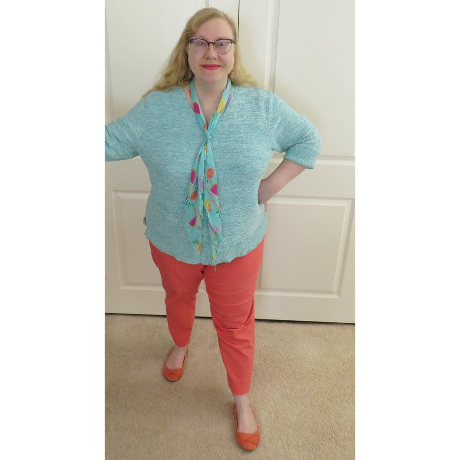
This outfit was my second to feature the fruit-themed scarf. My first outfit was from this past spring...in which I combined a light teal/mint heathered cotton sweater with a pair of coral pants and orange ballet flats. In this look, I used a simple tie on the scarf rather than draping it (see method #1 in this post).
This was also the debut of the paper bead bracelet set, which I supplemented with a slightly different set of beaded bracelets from my Vogue Cover outfit.

My earrings were a bead soup pair that I made to coordinate with a teal, orange, and gold paper bead bracelet set (not the fruit-scarf-inspired one I'm wearing). I used the simple but effective "bead stack with metal motif bead" design (see design #3 in this post) with 8mm glass beads in orange and teal plus a swirl-motif coin bead in antique gold color.

Now for my favorite part of every SIA post: sharing our Rabbit Imitating Art selection!
Today's rabbit is a bit shy but can't help but show off his wonderful sleek fur and the silvery-white edges around the black that is characteristic of the "otter" coloration pattern.

Satin Otter had heard that there were wonderful exotic fruits to be had at the seashore, but when he arrived, he was quite disappointed to learn that the "fruit" was just pictures drawn onto some human's scarf. What had been assumed by other rabbits to be a sign advertising a produce market was something called "fashion." Satin Otter inferred that "fashion" meant "pretending to be something it is not," which was more human nonsense.
Just as Satin Otter had made up his mind to hop away from a place that was wet, sandy, and sunny with no delicious food to justify it, he caught a fleeting glimpse of a vine swinging in the breeze underneath a green umbrella. "Oh good, finally some food! And with that umbrella to stand under, I'll be shaded and somewhat hidden too!" As he took the vine in his mouth, he realized that the "vine" was attached to another human and was once again not food, just "fashion."
His tugging woke the human wearing the "vine," and she felt that she must be still dreaming because an absolutely divine rabbit with the most gorgeous shiny black-with-white-edges fur was standing on the sand and nibbling on her scarf! But to her delight, it was no dream. At that moment, she had a vision: a model with a brightly colored parasol and cheerful scarf standing in the shallows on a beach, feet in the water, and wearing a dress in a black and white print. Mostly black but with white bits creating spiky patterns in the fabric. It would be her most stunning design for hot weather fashion yet! With a clear vision for her next summer collection, the designer petted Satin Otter on the head for a moment and said, "This calls for a celebration! One piña colada for me, and one piña for you. Waiter!"
And as summoned by magic, a human appeared next to them with a tray containing a glass of some fruity liquid with a small orange umbrella in it and a dish with chunks of an amazing-smelling yellow substance that seemed to be...could it be...oh my goodness, truly WAS an exotic tropical fruit of a kind he had never even imagined. Huh, maybe there was something about this whole "fashion" thing that was good after all!

Thanks for joining me today for this Style Imitating Art + Rabbit Imitating (and Improving) Art post!

To see other outfit interpretations of this artwork, check out the review on 14 Shades of Grey.
Is a color scheme combining so many brights like this magenta/hot pink, coral/orange, and teal/mint palette something you would wear? What do you think about black and white for summer? Would you wear black and white with vivid accent colors? What part of this drawing would inspire an outfit that you would wear?
Blogs I link up with are listed here.


Sự kết hợp giữa màu hồng cánh sen và cam trong trang phục mùa hè nghe khá táo bạo, nhất là khi tiêu đề đặt nó cạnh bìa Vogue của Sia. Tôi vừa đọc bài và tò mò xem tác giả nói về cách phối màu hay ấn tượng thị giác tổng thể. Khi xem nội dung về thời trang, tôi đôi lúc nghỉ giữa chừng và nghe người quen bàn chuyện trò chơi đổi thưởng; 23win là một cái tên từng được nhắc trong cuộc trò chuyện ấy. Liên tưởng không quá sát, nhưng nó làm tôi nghĩ đến những thứ dễ gây chú ý bằng màu sắc hoặc tên gọi. Bài viết vẫn là phần tôi muốn nhớ hơn.
Kết hợp màu đỏ tươi và cam trong trang phục mùa hè cho bìa tạp chí Sia nghe táo bạo, nhưng bài viết cho thấy cách phối màu rất hài hòa. Tôi không giỏi phối đồ lắm, nên đọc xong học được vài mẹo nhỏ. Nhân tiện, khi xem ảnh minh họa, tôi chợt nhớ đến một bài viết về xx88 cũng nói về phong cách thời trang của người nổi tiếng. Dù không liên quan, tôi thấy màu sắc trong cả hai đều nổi bật. Bài này khiến tôi muốn thử phối màu cam với các trang phục khác.
Bài phối màu tím hồng với cam trong trang phục mùa hè khá nổi bật, nhưng tác giả vẫn cố giữ sự cân bằng bằng cách dùng một màu làm điểm nhấn. Tôi thích phần phân tích về sắc độ hơn là những lời khen chung chung cho bộ đồ. Khi xem các bài về thời trang, tôi thường nghỉ một lúc bằng cách đọc chuyện linh tinh, từng thấy cái tên EE88 xuất hiện trong lời kể về Game bài đổi thưởng. Tôi không dùng nên không liên hệ sâu hơn. Bài làm tôi để ý hơn đến việc màu sắc thay đổi cảm giác về một bộ trang phục.
Bài viết về cách kết hợp màu hồng tím và cam trong trang phục mùa hè tạo cảm giác tươi sáng nhưng không hoàn toàn dễ phối. Tôi thích việc bài nói đến sắc độ, chất liệu và tổng thể thay vì chỉ khuyên dùng hai màu với nhau. Đọc lúc rảnh, tôi nhớ một người từng nhắc 7m: trong bối cảnh game bài đổi thưởng, chỉ là liên tưởng tình cờ. Bài khiến tôi nghĩ màu sắc phụ thuộc nhiều vào ánh sáng và hoàn cảnh, nên cùng một công thức phối đồ có thể tạo cảm giác khác nhau trên từng người.
Đọc xong bài viết về cách phối màu cam và hồng đậm cho trang phục mùa hè trên bìa tạp chí thời trang, thấy cách phối màu này khá nổi bật và táo bạo. Tự nhiên lại liên tưởng đến màu sắc giao diện sặc sỡ của một số nền tảng giải trí mà mấy đứa em họ hay bàn tới, hình như dạo trước chúng nó còn nhắc cả https://789club.cymru/ khi nói chuyện về mấy game bài đổi thưởng trực tuyến. Bản thân tôi thì hoàn toàn ngoài lề, chưa từng tạo tài khoản hay trải nghiệm bất kỳ dịch vụ giải trí nào kiểu đó nên cũng không biết chất lượng thực hư ra sao. Gu thời trang trong…