Combining Bold Colors and Animal Details for SIA Frida Kahlo and Her Pet Deer Granizo
- sallyinstpaul

- Mar 11
- 6 min read
Shelbee at Shelbee on the Edge is the curator for this round of Style Imitating Art (SIA), and she selected the 2020 illustration "Frida Kahlo and Her Pet Deer Granizo" from the book Pets and Their Famous Humans by New Zealand artist Katherine Quinn. She chose this artwork to continue Marsha's trend in celebrating International Women's Month, selecting a "female artist's depiction of another female artist."

I picked out items for my base outfit to interpret various aspects of the painting:
-Dark green-teal pants = the teal dress
-Open weave coral sweater = the fuzzy golden-orange cardigan
-Tan cheetah Oxfords = the spotted tan deer
This created a very bold color combination, but that felt fitting for both this illustration and for the work of Frida Kahlo herself.

I could have worn this as a colorblocked outfit with a beaded necklace to more straightforwardly mimic Frida's outfit, but I wanted to introduce more of the nature motifs of plants and animals from the artwork to my look. So I took the opportunity to debut this thrifted scarf I purchased in December. I love the dual print of leopard print (for another dash of animal print to represent the deer) with a mixed leaf/flower/plant print (which could stand in for both Frida's floral hairpiece and the plants at her sides). I thought that adding these softer versions of the bright coral and deep green-teal in my base outfit was worth a try.

It's interesting...I should have realized how prominent the minty sky blue color of the scarf would be, and how little of the salmon-coral color in the print would show, but I was a bit surprised by how the combination looked. I can't say I'm opposed to it; it did have the effect of putting a lighter, softer set of colors next to my face. I just didn't expect the amount of contrast the outfit has with the scarf, which veers away from the inspiration artwork a bit. But I still do like the extra animal print and plant motifs taken from the illustration into my outfit, so I'll call it a win.

I wore the scarf in the "loop to the front with ends loose" style (method #4 here), which did a nice job of showcasing the pretty mix of nature prints in the scarf.

My cheetah Oxfords are one of my very favorite pairs of shoes for wearing with pants; the "interesting menswear" vibe is great, and the tan color does a great job of bookending my blonde hair. I have racked up 110 total wears on these shoes for a current cost-per-wear of $0.90.

I built my daily bracelet stack around a paper bead bracelet set I made to coordinate with a white, coral, and aloe vera green floral blouse in my summer wardrobe. Although this was not a 100% perfect match to my outfit's color scheme, I knew I could draw out the bright orange/coral and dark green tones to create a stack that harmonized with my outfit. I love how well the irregular shapes and the color of the spiky green jade chip bracelet represent the dark green plants in the artwork, and I thought the orange round bead bracelet was a subtle reference back to Frida's red beaded necklace. {stretch bracelet tutorial} {bicone paper bead tutorial} {tube paper bead tutorial}

The top paper bead bracelet started out as a Land End catalog page featuring a vaguely fall nature themed set of PJs in summery citrus colors. I cut the page below the model's head ("off with her head!") before cutting my triangular strips. I left the areas of her skin tone as-is because its peachy color worked well with my desired color palette.

The middle bracelet with the gold flower beads has a bit of a surprising origin in this rather small catalog image of a woman wearing an orange and green print top and green pants. This is way too small to make bicone paper beads from, but I made the paper work for tube beads because only the end portion of the rectangular strips will show on the rolled beads. I added gold acrylic paint to the ends of the beads to cover the white, and as usual I brought the paint up slightly over the beads themselves, which I think adds a nice touch. I loved how these beads turned out.

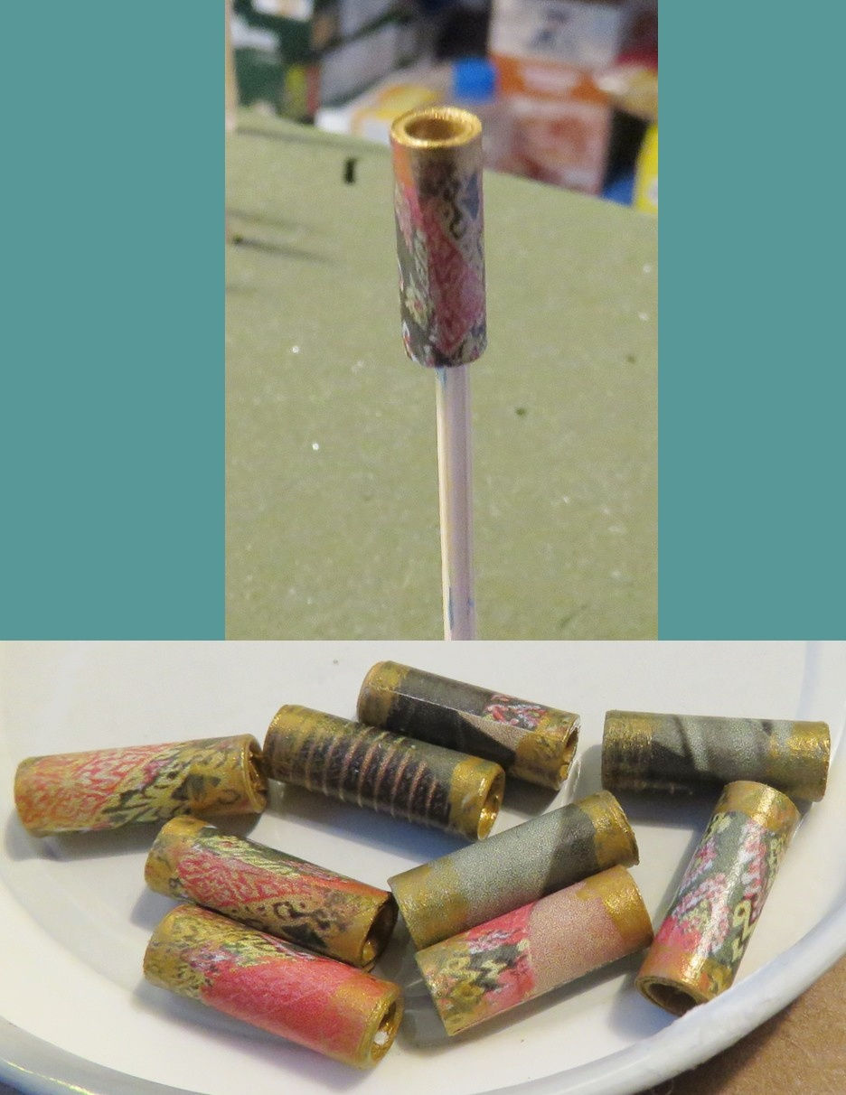
The bottom, mostly green paper bead bracelet was based on one of my go-to paper sources: an illustration from the top of an article in The Economist magazine. What's nice about a larger scale drawing like this is that the resulting beads obscure the details of the image, revealing the color scheme instead.


My DIY earrings are a fun reference to both the "pet animal" idea and the coral flowers in the artwork. The enamel charms show a black house cat who has knocked over a house plant, wreaking havoc. When you find a great pair of charms, all you need to do is add a pair of ear wires and you're good to go! I enjoyed seeing my black glasses come into their own for this challenge; of course Frida Kahlo is well-known for her large dark eyebrows, so I liked that my glasses brought a similarly strong, dark brow line to my own look.

Which brings me to a small criticism I had of Katherine Quinn's depiction of Frida: she really, really feminized Frida in a way that counters Frida's own embrace of her masculine side and her lifelong defiance of expectations surrounding traditional femininity. As Google's AI explains:

Of course this is just an illustration in a children's book, so what's the big deal...but then again, doesn't this drawing reinforce to children that girls/women are supposed to look a certain way, even what that appearance is so contrary to the actual woman being depicted?
There is a sense in which I find this sanitizing of Frida's appearance in a children's book more inappropriate than I would in a stand-alone work of art that would be speaking to an adult audience who would understand the tension between how Frida looked and represented herself and how the artist did (and in which that tension might be a big part of what the artist was saying with the artwork).
Frida Kahlo is a frickin' legend not just because of technical artistic ability but because of the boldness of her vision, the raw emotion of her work, her defiance of convention on multiple fronts, and her transformation of trauma and pain into art.
I get it, that this children's book about pet animals is not about that! But couldn't you still draw Frida with a whimsical and stylized aesthetic without making her so inappropriately "girly"?
It's funny...as just a drawing of a woman and a deer, I really like this artwork! I find it very colorful, fun, and visually appealing. For Frida specifically, I just wish she were allowed to look more like the unique and defiant Frida that actually existed, eyebrows and all. (I mean, note that the artist didn't feel it necessary to make Albert Einstein look more like an average man; he got to keep the wild hair and mustache!)
I appreciate Shelbee picking an artwork for this challenge that was so great for interpreting with an outfit and that gave us something to think about for International Women's Month!
Now for the less controversial aspect of this Style Imitating Art post: revealing our Rabbit Imitating Art!
I am an absolute sucker for a little mini rex rabbit, and this chocolate brown one with the alert expression and compact pose drew me in. Can't you just feel the softness emanating from that fur?? He looks even plusher than Frida's sweater in the artwork.

Granizo, Frida Kahlo's pet deer, despaired that despite people knowing SO MUCH about Frida's life, they knew basically nothing about their relationship. It was like most people didn't even know Granizo existed as an actual being and not just a piece of inspiration for her artwork.
But one day, things changed: the deer Granizo was so excited to be included in a book about the importance of pets to their companions! Granizo wasted no time telling all of this to his pet rabbit Minnie.
Later...
Minnie, Granizo's pet rabbit, despaired that despite people knowing SO MUCH about Granizo's life, they knew basically nothing about their relationship. It was like most people didn't even know Minnie existed...until now!

Thanks for joining me today for this Style Imitating Art + Rabbit Imitating (and Improving) Art post!

To see other outfit interpretations of this artwork, check out the review on Shelbee on the Edge.
What colors would you have used to interpret this artwork? What animal and/or plant motifs would you include, if any? Did you know Frida had a pet deer (I didn't!)? Did the artist's depiction of Frida Kahlo surprise you in any way?
Blogs I link up with are listed here.


This is such a fun take on the artwork! I love the colour of your sweater, it pairs so well with the scarf. You’ve really nailed this challenge, Sally. So nice to see you again at #MMBC! :)
The outfit looks great and fills the brief nicely.
I like what you said about Frida Kahlo and how she is presented in this art. I was lucky enough to see an interactive exhibition of her life and work a few years ago, she certainly was a complex woman with a challenging life. That said it is a really beautiful image.
That is the perfect scarf for this challenge! I love the beautiful sweater you paired it with too.
Frida had a very distinctive style when comes to her outfit and accessories and I like how you interpreted it into your own unique style. And I can't believe you made your bracelets and earrings.👍https://lookingfabulousat50.blogspot.com/
Cute shoes! I love the color combo here.
https://cannaryfamily.blogspot.com