Tonal Dressing to Mix Dark and Light Colors in a Spring Outfit for SIA: Allen Street
- sallyinstpaul

- Apr 8
- 6 min read
Marsha at Marsha in the Middle is the curator for this round of Style Imitating Art (SIA), and she selected the 1905 painting "Allen Street" by American artist George Luks. She chose this artwork because she wanted to find an art movement she had not heard about, and she couldn't resist the fun name Ashcan movement that runs counter to the typical "high brow" vibe. She particularly liked the colors in this painting.

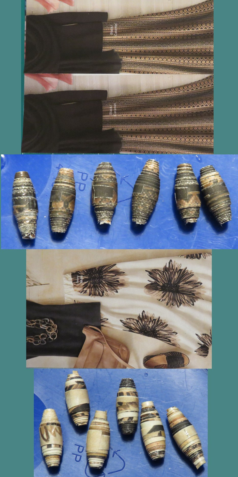
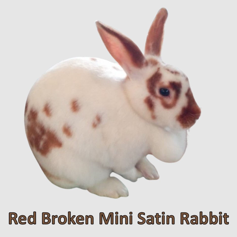
Because I am a color lover, and because I'm looking forward to the arrival of true spring, I focused my attention on the the lighter, more colorful part of the painting in creating my outfit. This interesting section with women stacking furniture and draping fabric has some wonderfully vivid green, orange, and magenta colors that pop against the dark brown background. As luck would have it, one of my scarves from last December's thrifted scarf haul at ThredUp contains these colors...plus it's a floral print, which is a classic and perfect spring option.

Although I could have easily styled a predominantly brown outfit using this scarf to replicate the overall darkness of the painting, I decided to switch things up by making my base outfit mostly light instead (which felt suitable for the spring-like vibe I was going for). The soft pink ground the beige hanging rug inspired me to select a blush-beige marl sweater, light pink puffer vest, and taupe-beige knit pants. I was curious if I'd worn this specific combination of sweater/vest/pants before, and a check of my spreadsheet revealed one previous outfit (shown here).

My 76-year-old mom and I were just talking about her spring/summer wardrobe, and she mentioned that she grew up in the hard-core "matching is what you do" era of fashion, which has made it hard for her to get comfortable with pairing things that don't perfectly match. I get it that the struggle is real! The difficulty older women - who came up during the "must match" era - experience in moving away from the matching mindset to a more modern and free style of mixing colors is something that Jodie has written about frequently on her blog and social media. My blog intern Gemini AI noted that the peak era of matching in women's fashion was the 1950s-1960s, which is the period in which my mom grew up and learned how a woman should dress.

My mom was showing me a few not-perfectly-matching wardrobe pairings that she'd recently discovered, which of course I loved to see. Her examples were great applications of a style idea I use all the time: tonal dressing - i.e., pairing items in the same color family that vary in their value (lightness/darkness). One of her examples was a floral t-shirt with multi-tone purple flowers that she wears with a lavender cardigan; the lavender color doesn't appear in the print but is a lighter version of the darker purple tones, so it coordinates beautifully.
You can see that I used the same technique in selecting the light base outfit to showcase my scarf: the pale pinks are lighter versions of the magenta in the flowers, and the beige colors are lighter versions of the brown in the scarf.

If color harmony is important to you or matching is your comfort zone for pairing items, but you are trying to find more mix-and-match possibilities in your wardrobe, give tonal dressing a try!

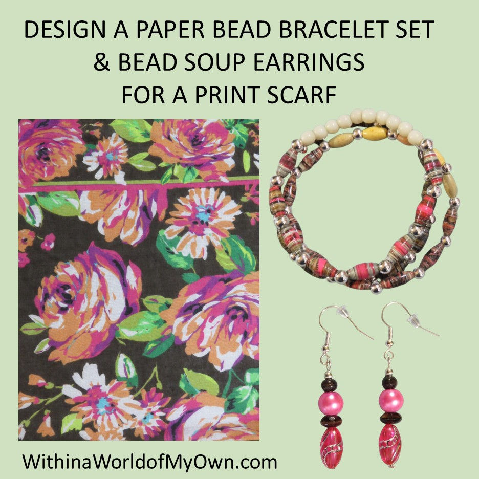
My all-DIY daily bracelet stack started with a paper bead bracelet set I made with this scarf in mind using a small number of the 2,000 homemade paper beads I made with no plan (discussed here). I brought together 3 groups of paper beads in a color scheme of bright pink, beige, brown (and black) to make the set. I completed the stack with beaded bracelets that repeated the pink, brown, and cream colors. {stretch bracelet tutorial} {bicone paper bead tutorial} {tube paper bead tutorial}

Unlike with my previous cobbled-together paper bead bracelet set, I do have photos that show the paper to bead process for this set.
The top paper bead bracelet has a surprising story in one way, but is very typical of my approach in others. On the typical side, I started out with a Lands End catalog page of a woman in a red coat with a tan dog, and I covered some of the extra white area of the strips with red marker. So the rolled beads had a good amount of red on them (as shown below). On the surprising side, I decided I had too many beads with red, and I colored over the red on the rolled beads with pink marker! Until the bead is glazed, you can keep experimenting with the colors to get the look you want.

The middle paper bead bracelet in shades of beige, black, and brown was made from two different sets of paper beads that I strung on a single bracelet. Both sets were made from Coldwater Creek catalog pages. The front area of the bracelet (that shows in my stack photo above) has beads using two pages (from two consecutive catalogs) featuring a black blouse and striped skirt. The back area of the bracelet has beads using an outfit layout with a neutral floral skirt.
The bottom paper bead bracelet also started life as two identical images from Coldwater Creek catalogs featuring a coral pink sweater and black floral skirt with a beige bag.

These pink/black beads as well as the black/beige beads in the middle bracelet were rolled using two strips of the thin catalog paper to get fatter beads. For the pink/black beads, I rolled two 6.5" inch strips together to make beads that measure 5mm in diameter. I know from experience that rolling only one such strip would make 4mm beads, and I wanted these beads to be chunkier than that.
Note: I have not memorized this information! I have a spreadsheet that lists the specifications for 876 groups of paper beads that I have made (not all the groups I've made, but more than half of them), so I can use filters to see that if I'm using paper type X and strip length Y and strip number Z and roller size Q, I will get beads of about K size. This is especially useful for figuring out how many strips to roll when I have a target for the paper bead size/diameter.

I pulled some bright pink and brown beads from my bead soup to make stick earrings that coordinate with the scarf and bracelet set. A couple of brown "chocolate glazed donut" glass beads from my mother-in-law's 2024 birthday beads gift made it into these earrings (between the two pink ones).

Now for my favorite part of the post: our Rabbit Imitating Art!
I knew I wanted a female rabbit who could assist the women in the painting with their work, and this industrious Mini Satin rabbit with the glorious dewlap and broken red-and-white fur pattern volunteered for the role.
As the women of the neighborhood set up their wares for the street market, Minnie emerged from under the stairs and took a quick look around. The display with the colorful fabrics caught her eye first, and to her shock and delight, there appeared to be two big fresh orange carrots in a vase atop a padded chair. She sneaked around behind the display while the working women were distracted, then quietly hopped up on a nearby chair to give the carrots a closer inspection.

As soon as she took in a quick sniff, all hopes were dashed; these were not vegetables at all, but some kind of textile wound up in a carrot shape! More human nonsense, but Minnie had agreed to take a job working in the market, so work she would. While chewing carrots and other Food was her favorite task, she was also quite adept at chewing wood, cardboard, paper, grasses, and fibers. To motivate herself, Minnie decided she would race against the workers around her, attempting to chew the orange wrapped textiles into nothing before the women were done setting up their stand. Truly, what would these humans do without her help?
Thanks for joining me today for this Style Imitating Art + Rabbit Imitating (and Improving) Art post!

To see other outfit interpretations of this artwork, check out the review on Marsha in the Middle.
Are you more attracted to the dark colors or the light colors in this painting? Does the matchy vibe appeal to you? Do you ever struggle to mix together pieces that don't strictly match? Do you like to blend lighter and darker versions of a color in an outfit (tonal dressing)? What do you think the orange carrot-looking things that caught Minnie's eye are meant to be?
Blogs I link up with are listed here.


You are doing a great job! Every follow and unfollow tells a story. When someone chooses to unfollow your account, it can signal a shift in their interests, dissatisfaction with your content, or even simple algorithm-driven disengagement. You can tracking https://theunfollowerstracker.com/ these changes , bloggers gain valuable insight into how their content is being received. Instead of guessing what works, you can start identifying patterns. Did you lose followers after posting too many promotional posts? Or perhaps engagement dropped when you shifted your content style? These small details can guide smarter decisions.
Very interesting, I've never heard of "ashcan". I'm not really drawn to the painting, it looks a bit murky. A difficult one to interpret but you succeeded with that sensational scarf and your clever bead technique. Thanks for linking!
You look lovely!
Oh, this was such an interesting post in so many ways, Sally! BTW...I got an email for your post!! My mom would have been of about the same era as yours, but she never had a problem with matching her shoes to her bag because all she ever bought were black shoes and bags! She just wasn't into that kind of thing at all. Her most fashionable item was her jelly bean tank top that she wore and washed until the jelly beans were almost completely faded away. Second, why am I not surprised you have a spreadsheet for your beads and how to make them? Next, I love your outfit and the tonal dressing! I also focused…
Love this interesting painting that Marsha chose. There is so much activity going on in the artwork, my eyes move around and around examining all the details. The SIA participants all did a great jobs at interpreting this lively piece. I love that you chose the lighter shades of the painting, and your tonal outfit turned out beautifully. I do struggle with not being matchy-matchy at times, it is definitely my comfort zone. I think one reason is because I was dressed when I was a child by my grandmother,
who matched her outfits impeccably, and also my interest in mid-century design and clothing, which is very matchy oriented. I so enjoyed this post, and your rabbit improving art camoflages…