Combining Black and Brights in Summer for SIA: Matt Beyrer
- sallyinstpaul

- Jun 3
- 6 min read
Shelbee at Shelbee on the Edge is the curator for this round of Style Imitating Art (SIA), and she selected the dye sublimation on wood "Triumphant Salute" by contemporary artist Matt Beyrer. She wanted to pick an artwork to "honor our nation's fallen soldiers on this national day or mourning" and chose this artwork because it had an emotional impact for her, and she thought the colors were beautiful...which is absolutely true.

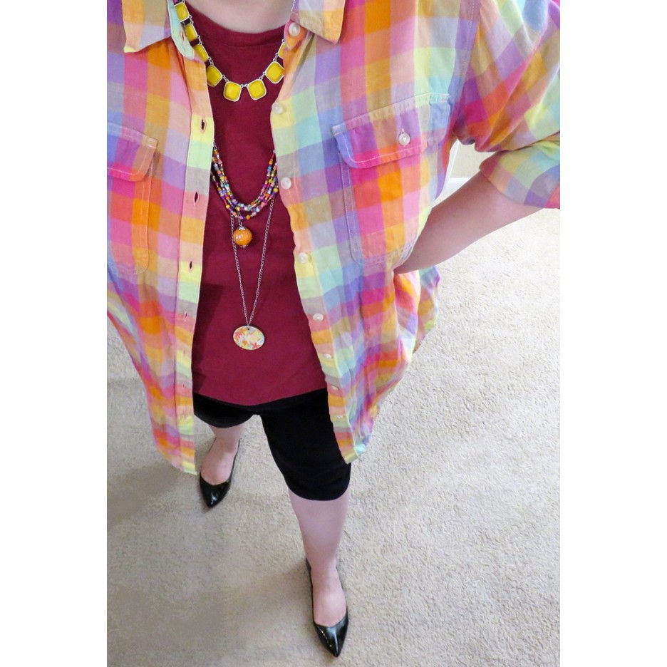
Since magenta and black are the dominant colors in this artwork, I picked out a simple magenta t-shirt, black skimmer shorts, and black flats as the basis for a casual outfit.

OK, but how did I want to bring in the other gorgeous colors of the sky? I have scarves that would work, but I didn't want to wear a scarf on a warm day. But the sunrise/sunset concept reminded me that I'd recently made a paper bead bracelet set that used 3 sunrise/sunset images for the beads. I didn't think the bracelets alone would have enough of that bright sky energy for the outfit, so I decided to wear the linen shirt that inspired the beads as a lightweight shirt-jacket to brighten up the look. The shirt has a geometric pattern rather than the swirls of color in the artwork (note: what we are seeing is the grain of the wood - cool, right?), but I thought the checks were sufficiently low-contrast to avoid an inapt highly optic look (such as the black and white outfit featuring a check shirt shared in the recent Thrifty 6 post).

I really wasn't sure whether the bright check shirt and the black skimmers would look okay together or not! There is basically nothing about these two pieces that relate them to each other; the colors are about as divergent as it gets - bright saturated pastels in a low-contrast check pattern on linen vs. stark black pants. Very much a possible "I just wear everything with black pants whether they work or not" kind of outfit. I hoped my black glasses and Alice band in my hair would be enough to sort of sell the combination. I'm not sure it completely worked, but I liked the result okay...which I am going to take as a win!

I think the black shoes are key to making the black skimmers look kind of intentional rather than "I need to do laundry." I am not a person who defaults to black shoes (I did a whole "how to pick a shoe color" series with some of my strategies for summer shoe selection) but this outfit really needed them (see this post on matching shoes to pants/skirt).

I took this opportunity to layer jewelry in the bright colors of the shirt. If I'd thought about it, picking a necklace that combined the bright colors and black could have helped a bit in bridging the two different vibes, but instead I went all-in with the spring/summer tones: a yellow necklace from Kohls, a DIY seed bead wrap necklace in the colors of the shirt, and a coordinating paper pendant on a chain {tutorial}. This is a good example of my go-to lengths for a layered necklace:
(1) a short necklace that fits inside a V neck of a top/collar of a shirt or just underneath a crew neck (in the 19-23" range);
(2) a mid-length necklace that hits the chest above the bust (in the 26-30" range);
(3) a long necklace that ends below the bust (in the 36-40" range).

Here is the paper bead bracelet set in action, supplemented by 3 simple DIY glass bead bracelets in candy pink, sandstone coral, and light dusky pink. Note that this was yet another opportunity to introduce black in my jewelry that I didn't take advantage of; two of the paper bead bracelets even have a bit of black in them to make that easier, but I had the summery colors on the brain! {stretch bracelet tutorial} {bicone paper bead tutorial} {tube paper bead tutorial}

I was really looking forward to showing you how these sunrise/sunset images transformed into paper beads...but then I realized I forgot to photograph the original pages - uff da! But at least we can enjoy this close up of the beads made from: (1) Economist magazine cover; (2) and (3) calendar pages. I loved how these beads have a range of colors: yellow, orange, salmon, light pink, dark pink, lavender, periwinkle blue. It's a broader range than the sky in the artwork, but really captures that sunrise/sunset feeling to me.


My earrings were also inspired by this shirt, though they go in a bit of a different direction: pulling the magenta and light green/mint colors. The turtles have literally nothing to do with the artwork but they're just so cute. (See earring design #7 in this post for more information.)

My main tip for combining a bright colored print with black in summer is to select a print that already has a bit of black in it! I have multiple print tops, skirts, and scarves for spring/summer that follow this approach, and they are SO MUCH EASIER to pair with black. Of course there is a trade-off: if the print has black in it, it can be harder to pair with non-black neutrals, so you need to think about that.
But if you are wanting to style a bright print that doesn't also include black, I think it's easier if the bright print has truly vibrant pure hues that are not mixed with another color or has shades that have been toned down a bit with black. It's harder if - like my check shirt - the colors are more on the pastel end of the spectrum (toned down with white) or are muted colors that have been toned down with grey.
I will admit that I am unlikely to wear this particular combination of saturated pastel check shirt, solid magenta top, and black pants again because (1) I prefer my colors more integrated and (2) the difference in color between the light brights and the stark black was just too far for me. I don't consider it a failure, and I thought it turned out well for this style challenge, but I do find it easier to style and more harmonious when paired with denim/chambray or a color from/similar to one in the print. I also think lighter colored neutrals like white, cream, and grey are worth experimenting with as they share a sense of lightness with these saturated pastels.
It's interesting to me to realize that I would find it easier to pair any one of the colors from the print with black than the print itself with black. I assume it's because the colors in the print share so many qualities among themselves (and are all in close visual proximity to each other) that they make the black look like an outlier rather than an equal partner in the outfit.
Now for our main event of every SIA post: our Rabbit Imitating Art selection!
Given the serious nature of the artwork and the silhouetting of the human figure, I decided that a black rabbit with an upright and attentive posture would be the perfect addition. This black mini rex with the "otter" coloration pattern (a single dominant color with some "edges," such as around the eyes, in white/cream) volunteered for the job.

The bunny took his place at the soldier's side while he saluted a cross with a flag attached to it, paying respects to those who died in war in service of their country, a fitting tribute for Memorial Day. While the soldier remains completely focused on the meaning behind this national holiday, the rabbit looks over his shoulder at the viewer as if to remind us to take a moment as we kick off the unofficial start of summer with backyard barbecues, camping trips, or days at the pool (or Xbox) to remember the soldiers who have fought and died so that we may celebrate life. If, like me, you kind of forgot to do this on the day, it's not too late to take a beat right now for remembrance and gratitude.

Thanks for joining me today for this Style Imitating Art + Rabbit Imitating (and Improving) Art post!

To see other outfit interpretations of this artwork, check out the review on Shelbee on the Edge.
How would you have approached interpreting this artwork as an outfit? How would you balance the serious subject matter with the vibrant colors of the sky? Would you have veered toward the somber or the cheerful? Can you make any color paired with black work in your outfits? What's your best tip for pairing black with brighter summer prints in summer?
Blogs I link up with are listed here.


It's a stunning artwork, and your colorful shirt caught my eye immediately. The colors are perfect. Lovely jewelry too. Thanks for linking at #TuesdayTwirl
Sally, I loved seeing how you pulled the colours from the artwork into your outfit, and your jewellery is absolutely gorgeous. I think the bright shirt worked really well and gave the whole outfit a lovely summery feel. #MMBC
I always like a fabulous contrast like this because you really concentrate on the beautiful colors, especially with your handmade creations. XOOX Jodie
I really like the magenta under that shirt, it works really well.
This is an amazing piece of artwork. Using the grain of the wood to imagine the sky in those brilliant colors is, well, brilliant! I like your interpretation. I think you came up with a thoughtful compromise on a difficult color challenge for spring. I can relate to your comment about just wearing everything with the black. I'm afraid I am guilty! I usually run into trouble with black in the summer months, though. If I use it, I try to keep it as an accent with white or brights. Thanks for sharing your thoughts and hope you have a good week.