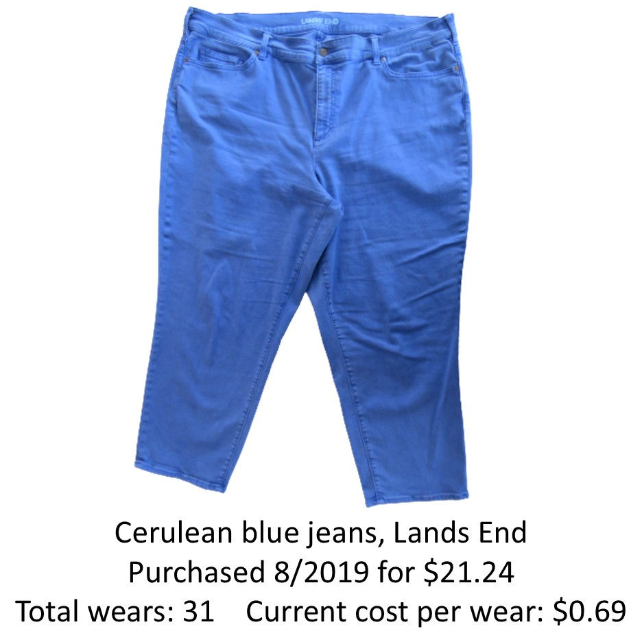
How to Wear Bright Blue Pants with 30 Wears: Cerulean Blue Jeans
- sallyinstpaul

- Mar 30
- 5 min read
Seeing Mica's recent 30 wears post for her olive tank top reminded me that it's been a while since I've done a 30 wears post, so today I am featuring a pair of cerulean blue ankle jeans that I bought at Lands End. This was an odd purchase for me because I bought them in a Lands End store! I had some returns to make for an online purchase, and while I was at the store, I decided to take the opportunity to try some things on. The vivid blue color of these jeans were just so cheerful and fun that I had to buy them (it was a total impulse purchase). In my climate in Minnesota, these ankle jeans are a 3 season item that I can wear from spring through fall (roughly March-November) so they are versatile and have earned their place in my wardrobe.
Here are some different ways I've worn my jeans, which could be adapted for any pair of bright blue pants/shorts/skirt.
1: Individual Accent Color
I am starting with the boldest choice, pairing the bright blue with another accent color. The two-accent-color combination creates a dynamic look that carries an otherwise simple outfit. There are two straightforward ways to think about a bright color pairing like this: colorblocking and bridging.
On the left, I've added pink for a colorblocked look (pink top & shoes, blue pants & necklace). The pink striped top worn as a jacket tones down the brightness and adds a lightweight layer, but it's totally optional. You could totally just wear a bright top, the blue pants, and neutral shoes/jewelry for an easy but chic look.
On the right, the sandstone coral striped top is more visually integrated into the outfit with the addition of a bridge print scarf that pulls the colors together.

2: Rainbow Colors
Any kind of multi-colored, rainbow-type print is a slam-dunk with bright blue (or any other rainbow color). This creates a great way to explore different levels of accessorizing from basic to extra.
This outfit with a rainbow striped shirt and floral sneakers demonstrates how a minimally accessorized look (no jewelry or scarf) can still pack a punch with the use of bright colors and print mixing.

Here is a moderately accessorized version (simple pearl earrings, gold tassel necklace, and colorful bracelet stack) with a rainbow striped linen top and solid flats. Very fun and visually interesting but simple to put together because (1) the earrings and necklace (and bracelet, if you choose a plain metal/neutral option) are basic, versatile neutral pieces that you can grab and wear without a lot of effortful coordination and (2) the shoes are in a color similar to the pants.

For a maximally accessorized outfit (dangly earrings, silk scarf tied French girl style, layered necklaces, bold bracelet stack, and rainbow striped sneakers), a neutral top in faded indigo blue linen creates a low-key background for the accessorized to stand-out against. Any blue chambray/denim shirt or a white top would have a similar effect.

3: Navy & Accent Color
Navy is a great neutral to pair with bright blue, and for added interest, you can easily include an accent color like the peach-coral in the print T-shirt I'm wearing (which creates a complementary color scheme because Blue and Orange are opposites on the color wheel). This print top hits all my "color integrator" buttons because it contains both the navy and a blue similar to my pants, but there is a lot of room to experiment here with combining the blue pants and navy (or denim/chambray) with different accent color solid and print pieces for both colorblocked and bridged looks. In both of these outfits, I kept the accessories simple (matching or neutral) so the print would take center stage.

In this outfit, the butterfly print scarf is the star of the show that pops against the dark blue polka dot T. I added a silver/aqua peacock pendant necklace and mustard flats using the Road Map Styling technique of pulling additional colors from a print.

4: Navy Stripes
Striped pieces are great because you can almost always treat any white striped item as a solid (I say "almost always" because no doubt there are specific combinations where this fails), so a navy and white striped top is a "more interesting than plain navy" option with bright pants.
On the left, I have worn a navy striped top with a stone/beige utility vest and added a bridge piece scarf to tie the colors together. Simple navy flats bookend the top.
On the right, a top with two different navy and white striped fabrics creates a print mix with the same butterfly print scarf we saw above for a more colorful/less neutral-heavy option.

5: Navy "Modern Twin Set"
Of course, wearing a navy top (and optional navy topper layer to create a "modern twin set") is an option for creating a simple backdrop for featuring statement jewelry or print scarves. This can be done with any mix of brights, muted colors, and neutrals that strikes your fancy.
On the left, I created a print version of the modern twin set by pairing a silky navy blouse and a bold polka dot blazer. I went for a maximal look with a bright color print mix of floral scarf and floral sneakers. I love the scarf with the outfit even though the white and navy colors from the blazer isn't repeated in it; the bright blue leaves pick up the blue of the pants and the overall print bookends nicely with the sneakers.
On the right is a more neutral and classic outfit in which the blue pants are the statement piece. A navy twin set of knit top and boyfriend cardigan provides the background for an elegant silk scarf with navy and blue; I pulled the brown from the scarf using Road Map Styling to choose a pair of simple leather flats.

6: Shades of Blue
Monochrome dressing takes a modern twist when you select multiple shades of a color into a look for a tonally layered look.
These two outfits pair the bright blue pants with a light blue top and accessories with multiple shades of blue. The result is cohesive but visually interesting as different tones, textures, and prints are combined.

A print top with multiple shades of blue can work well with bright blue pants, even if none of the blues are an exact match to your pants; the varied blues create a sense of "many blues" within which many shades of blue will work rather than specific blue tones that must be matched.

It actually took me a while to start wearing this bright blue and white striped top with my pants because the colors don't really match and struck me as possibly falling into that "uncanny valley" of color matching where it looks like you thought they were the same color but they're not. But it was frustrating because surely I should be able to wear these pieces together! What got me over my own psychological barrier about pairing these items was to add a colorful multi-print scarf as a distraction. These are two versions that I tried, which are OK in my opinion but not great. The top is just so intense with its bright stripes that it's difficult for a print to stand up well to it. I think this base outfit is more suited to wearing some bolder scarves with more optical prints or even a vivid solid scarf with it...

...and here is such a scarf! This fabulous tiger zoological print scarf with a gorgeous sky blue background and darker blue tiger features has the boldness needed to stand up to the optical striped top. It also works (though perhaps a bit less well) with the more blended "print" of the ombré marl blue sweater.

Do you own any bright blue jeans/pants/skirts? Or any other brightly colored bottom pieces that could be worn the same way? Do you have a favorite season for wearing bright blue or other bright colors? How should I wear my cerulean blue jeans next?
Blogs I link up with are listed here.


Nice combos! I used to wear a pair of red pants, but usually with one of my black graphic tees.
Good grief, I need you and Jodie to come dress me!! I would see those pants and match them with something white or blue and then think that was all I could wear them with. LOVE them with that soft peach, with the pattern mixing, with the multicolor stripes. And your shoes are all so much fun. You certainly made a wise purchase when you bought them.
Sally, this is a lot of great inspiration for me, because I have two pairs of bight blue pants. I wear this color all year round. I think it is season-less, and is one of my favorites! You have a fantastic accessories game, with a scarf and jewelry to compliment every outfit. I have a lot of scarves and jewelry too, but I tend to wear the same small percentage of pieces over and over. I need to branch out and be more daring with what I have. Thanks for sharing, and hope you have a good rest of the week and Easter.