Brown Color Combos: Maroon
- sallyinstpaul

- Feb 27
- 3 min read
Today I am continuing my brown color combos for fall/winter outfits series with maroon, a rich dark red that makes a match made in heaven with earthy brown tones. I have 2 maroon + brown outfit examples to inspire you in ways to wear the season's trendiest color. This combination may strike you as fall forward rather than a choice for the current winter-becoming-spring season, but wearing non-traditional colors during a season feels modern and is a way to show your own personality. And based on your personal coloring and your preferences, you may like earthy tones like brown and maroon year-round.
First, I want to share a pair of maroon pants in my go-to Effortless Stretch Pants straight leg style that I purchased in December 2024 (Kohls "crimson" Plus, Straight, not affiliate links). I wore these pants in both of my outfits.

Now, on to the outfits...
Outfit #1: In this look, I paired the maroon pants with a dark brown "modern twin set" made from a brown knit top (Lands End) and brown boyfriend cardigan (Woman Within).
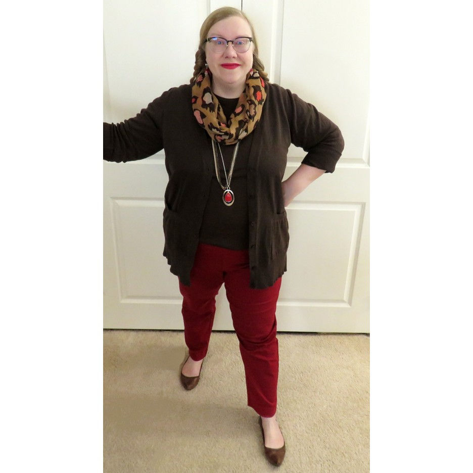
I chose my go-to scarf for brown and pink/red color combinations - a stylized leopard spot infinity scarf (recently shown here) - and layered a couple of long necklaces beneath it to break up the expanse of brown. The mix of metals looks contemporary, and the pendant provides a nice pop of bright red against the dark background.

I chose my trust brown leather flats to repeat the color of the top - the "matching top and shoes" color formula.

Because I don't yet have a brown-and-red paper bead bracelet set, I chose a memory wire bracelet with dark red/maroon, various pinks, brown, and ivory beads that I made to coordinate with a scarf in my collection. It's very handy that even when you make a piece of jewelry with a specific item in mind, you can usually find many other outfits to wear it with. In this case, seeing how well the bracelet worked in the outfit made me realize that the inspiration striped scarf would also look good with this brown and maroon base outfit.


I wore a pair of earrings that I made as part of a necklace, memory wire bracelet, and earrings set in red, soft pink, and silver. I made a simple stack from red crackle glass, red rhinestone spacer, and rose quartz beads. The shape of these earrings remind me so much of the bishop in a chess set!

Outfit #2: This outfit uses the same brown cardigan and maroon pants with a bridge piece print top substituted for the solid brown one.

I chose my shoes based on the "match your skirt/pants" idea (discussed in depth in this post) to keep things simple.

My two-piece layered necklace ("Apple Harvest" previously shared here) was made to coordinate with a black/olive/orange/maroon floral skirt in my closet, but this color palette of maroon, olive, lime, and gold works very nicely with this print top too! Don't the lime glass pearls stand out especially well against it for a low-key pop of color effect?

For once I am wearing a piece of jewelry with the item in my closet that inspired it! This 7-round memory wire bracelet includes all the colors from the top I'm wearing, and the combination of different sizes, shapes, materials, textures, and finishes on the beads makes me smile.


My earrings were made to go with the layered necklaces, combining red-green duo style glass beads, olive crackle glass, and dark gold spacer beads for another simple but effective stack earring (see design #2 in this post).

Interested in some street style inspiration for combining brown and maroon? Who What Wear has some looks for your perusal.
Do you have any maroon (or similar) colored items in your wardrobe? Do you limit wearing earthy dark red, olive, brown, etc., colors to the fall season or would you wear them in other seasons too?
Blogs I link up with are listed here.


Thank you for a fantastic post and a all round interesting blog. Thank you so much for sharing. Telly Updates
Thank you for a fantastic post and a all round interesting blog. Thank you so much for sharing. DG Club
Thank you for a fantastic post and a all round interesting blog. Thank you so much for sharing. V3 Game
Thank you for a fantastic post and a all round interesting blog. Thank you so much for sharing. 99 Club
Raja Game download was quick and easy. The game offers great entertainment with interesting features and levels. I’ve been playing daily and it keeps getting more engaging every time.